The objectives
After doing their research, Harrogate Neighbours knew they needed to give their current website (hnha.co.uk) some serious T.L.C if it was to become the helpful website they know their customers need, and work as a key component in their new multi-channel marketing strategy.
They needed a website built on a reliable CMS (we chose Umbraco) that was able to stand out from the crowd in a very saturated marketplace.
It had to successfully encourage new staff to join their growing team. It needed to better promote who they are, what they do and who they can help.
It had to achieve good PageSpeed and Accessibility scores measured through Lighthouse, organic ranking positions had to be maintained, if not improved, and last but by no means least, the website had to be a platform for growth.

Working with registered charities like Harrogate Neighbours, we understand that every penny really does count too. An investment in digital needs to make everything work harder, not just smarter, and it needs to be completed on time and on budget, which is exactly what we did.
What we did
Our work with Harrogate Neighbour’s all started with a workshop to help our team understand more about who they are and what their new website needed to achieve. Then we were treated to lunch made by Harrogate Neighbour’s in-house catering team and taken on a tour of their amazing facilities at The Cuttings, where the highlight had to be the railway themed activity room and a jolly journey on the train!
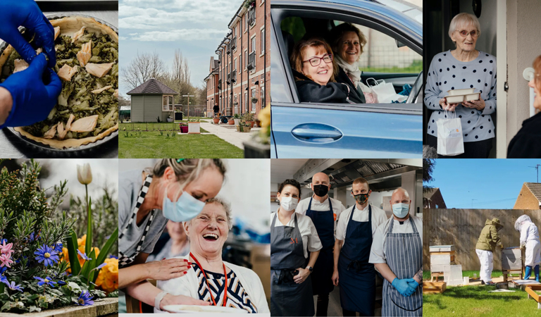
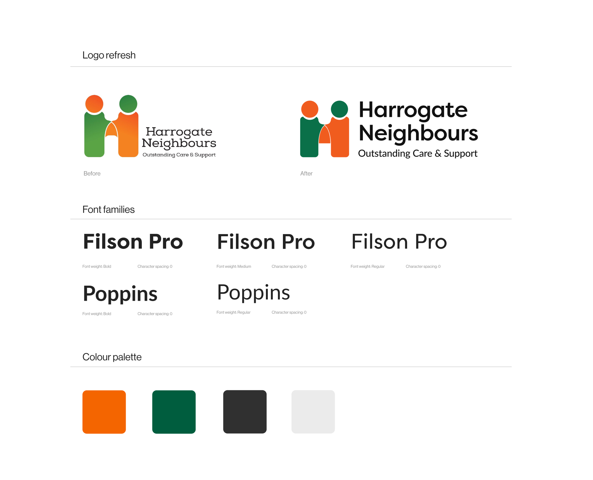
Then it was down to design. Our creative team achieved a complete redesign of their website, using their suite of new brand assets, which had also been completed transformed, for a modern look and feel. We supported their professional photographers during on-site photo shoots to make sure we had the right images to bring their brand to life across not only their website, but their social media platforms too. Performance tracking was overhauled, fixing historical issues with implementation and creating a new monthly performance report configured to help the team at Harrogate Neighbours easily measure and understand their return on their investment in digital.


Taking care of the career crisis
The care industry is facing a careers crisis. Getting the right candidates in the right roles and attracting new talent into the industry is still a challenge to be overcome. Harrogate Neighbours knew that if they were to meet their recruitment goals over the next few years, then reducing friction in that user journey, successfully telling the story of who they are and promoting the very real benefits of a career in care was vital.
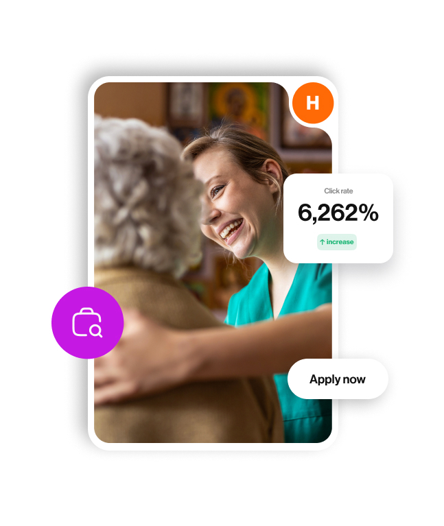
We created a brand new, dedicated careers section on the Harrogate Neighbours website, with a tailormade application form as well as a downloadable application form. This supported potential employees with two ways to apply for their chosen role, to improve the user experience by allowing them to choose their application method. By carving this out as a dedicated section of the site as well, it gave Harrogate Neighbours the digital space to tell their employer brand story and connect better with people interested in a career in care.

Over the first 12 months since go live…
increase in new users to the site.
increase in average engagement time per session.
increase in pageviews.
increase in file downloads.
increase in clicks to apply for jobs.
increase on contact us form completions.
Today our journey with Harrogate Neighbours is still on track.
We have the pleasure and the privilege of helping to support their Annual Ball each year, a highlight in the Pixel team’s calendar every October. Not only that, but we’re also still working in partnership with Harrogate Neighbours to help make their digital experience even better, from offering digital marketing advice, to making and actioning best practice recommendations and creating new features, functionality and content to help promote their new services including the Community Hub and their Heath Lodge Community Haven in Boroughbridge.
The team at HNHA have thoroughly enjoyed working with Pixelbuilders on the website project. You have been patient with us as we have added and removed things and have guided us in the areas we knew little about. Even when we were indecisive about the colours; you were not faced at all. Oliver, you have been fantastic - so great with the staff team and I know they enjoyed the training with them. In all the whole experience has been great and we have a website we are proud of and will grow with us as the organisation moves forward.
Sue Cawthray
Chief Executive Officer


