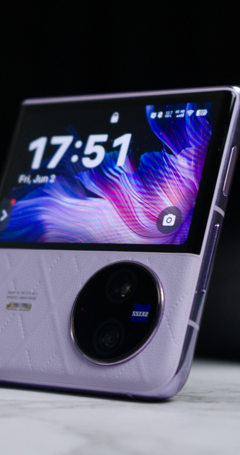
Foldable phones, they look amazing, the technology is tempting and the design is impressive… but heaven help us, how tricky could building a website for these devices be?!
It’s an important question, because at the time of writing there are already at least four different foldable phones that the general public are aware of.
We have the Royole FlexPai, arguably the first foldable “phone” currently available to buy (for a not-so-unreasonable £1,209). We say ‘phone’ because like many of these devices, strictly speaking it is something of a hybrid between a smartphone and tablet but that’s another debate for another blog post…
Next we have the Samsung Galaxy Fold. Available on EE this is the second foldable phone on the market and this time you’re looking at nothing short of around £2,000 to get one in your pocket. It has some serious specifications though, including the ability to multi-task. The Galaxy Fold boasts a multi-active window that let’s you maximise all that screen space by using not one, not two, but three apps at the same time on the inner screen, using a split screen or pop up view. Impressive!
The third foldable phone is the Huawei Mate X, again priced at the £2,000 mark it’s not cheap but unlike the two foldable phones we’ve already mentioned, this one appears to be the most truly phone-like. It is also the only model to fold outwards rather than inwards like a book. This means it has the added allure of working as two separate screens when folded and one single screen when opened. (Another web development headache in the making perhaps?)
The fourth foldable phone we know about right now is the Motorola Razr, a modern take on the classic noughties flip phone we all remember so well. In this model the screen spans the top and bottom of the internal side of the device creating a book fold that works vertically instead of horizontally this time (and possibly meaning yet another screen size to contend with?) however the appeal here isn’t so much the screen and spec but the price.
According to a report by The Wall Street Journal, this little number will cost in the region of just £1,170, far less than the offerings from Samsung & Huawei. There’s no release date for this device yet though, only the promise that they have “no intention of coming later than everybody else in the market”.
All interesting stuff so far, and plenty for web designers and developers to start thinking about from a usability point of view. And yet the complexities don’t stop there. Foldable phones are one thing but now Xiaomi has gone arguably one step further with the Mi Mix Alpha, while only a concept phone at the moment, this device shouldn’t be dismissed given the company’s previous successes with pushing the boundaries of phone screens.
The Mi Mix Alpha isn’t foldable, instead it is a “surround-screen”. That means it has the same ability as the Huawei Mate X to work as one continuous screen or two separate ones but more than that, it delivers an entirely new mobile experience (and another set of possible website design & development hurdles to overcome”.
Specifications, screens and excitement aside, what the creation of all these new devices tells us, is that the mobile industry and the technology industry alike, definitely think there’s mileage in creating these kinds of devices. The public seem to be responding positively to these “concept smartphones” too, just look at some of the feedback Xiaomi’s Mi Mix Alpha received recently…
So, from our point of view, it would be pretty short-sighted not to at least start considering what this might mean for website design and development as we know it. How will users interact with content on these new displays? Will responsive design need to accommodate all resolutions by default? Will operating software be smart enough to lock applications down to the standard view port rather than always make use of the full screen?
There’s plenty to think about, so we best get started… watch this space!


