
Black Friday, it comes around every year and every year it seems to start earlier and earlier. For brands, it’s all about frantic marketing, intense competition and high stakes discounts, designed to tempt consumers into some extra festive spending. For consumers it’s like walking a tightrope: to buy or not to buy… However, whether you’re a brand or a buyer, one things for sure, Black Friday always brings out the best and the worst in ecommerce design and this year is no different (which is really saying something in 2020)!
Now there are a few user experience (UX) and ecommerce design best practices that every big brand will have at the forefront of their mind when creating their Black Friday content. In this blog post, we’re going to look at who got these core design decisions right and who got them wrong.
Black Friday design principle number one
In order to stand out from the competition, the landing pages on your website need to really pack a punch and prioritize the biggest savings.
The good & why
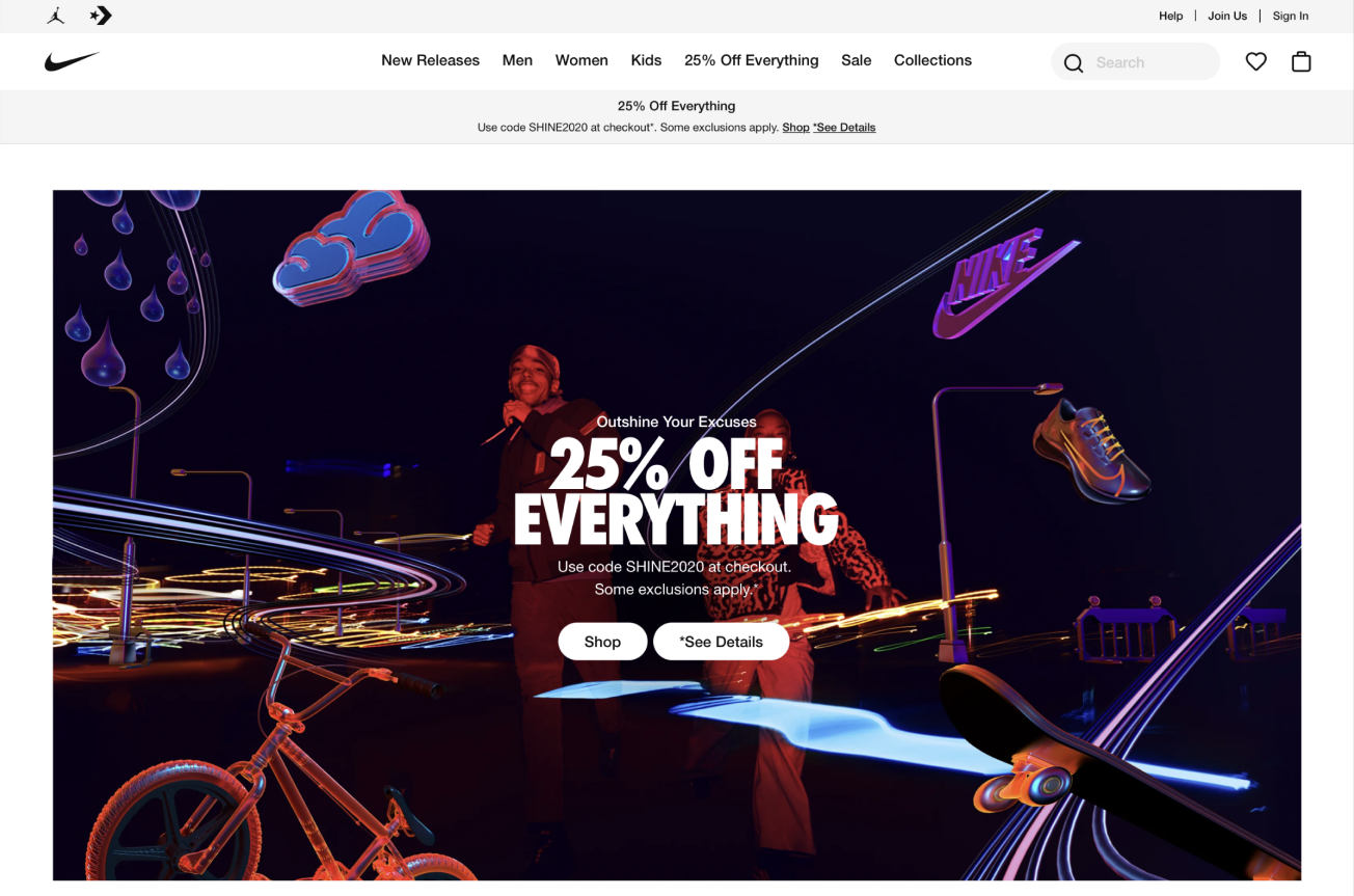
Nike have nailed design principle one here, the banner is static, so all users see it upon landing on the website. The banner design is bold, colourful and striking so it grabs your attention. The discount on offer is clear and unambiguous; not only do you know you’re going to be saving 25%, you also know how to secure this discount as it gives you the code and finally there’s not one, not two, but three obvious points of entry to start shopping in the sale. Well done Nike.
The bad & why
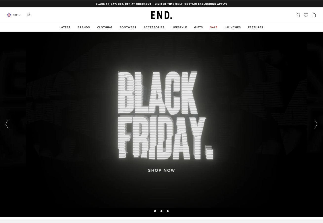
While at first glance this content from End may seem like it fits the bill in terms of packing a visual punch, the use of a carousel means other content is hidden in the slides and the “shop now” call to action to actually access their Black Friday sale is on the subdued side to say the least. Any mentions of how much you’ll actually be saving in there sale are also nowhere to be found on first viewing!
Black Friday design principle number two
You must remove any potential barriers to conversion to ensure you get the best return on investment from your Black Friday marketing efforts. A classic example here is offering free delivery.
The bad & why
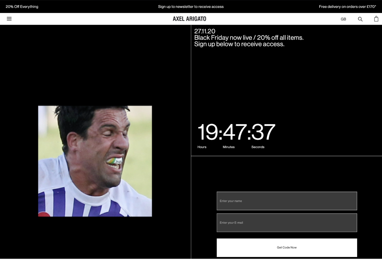
Here Axel Arigato are actively placing barriers to conversion on their website by forcing users to sign up to their email marketing in order to gain access to the sale in the first place!
Black Friday design principle number three
Don’t make users work out what discount they're getting, it should be clear, upfront and obvious.
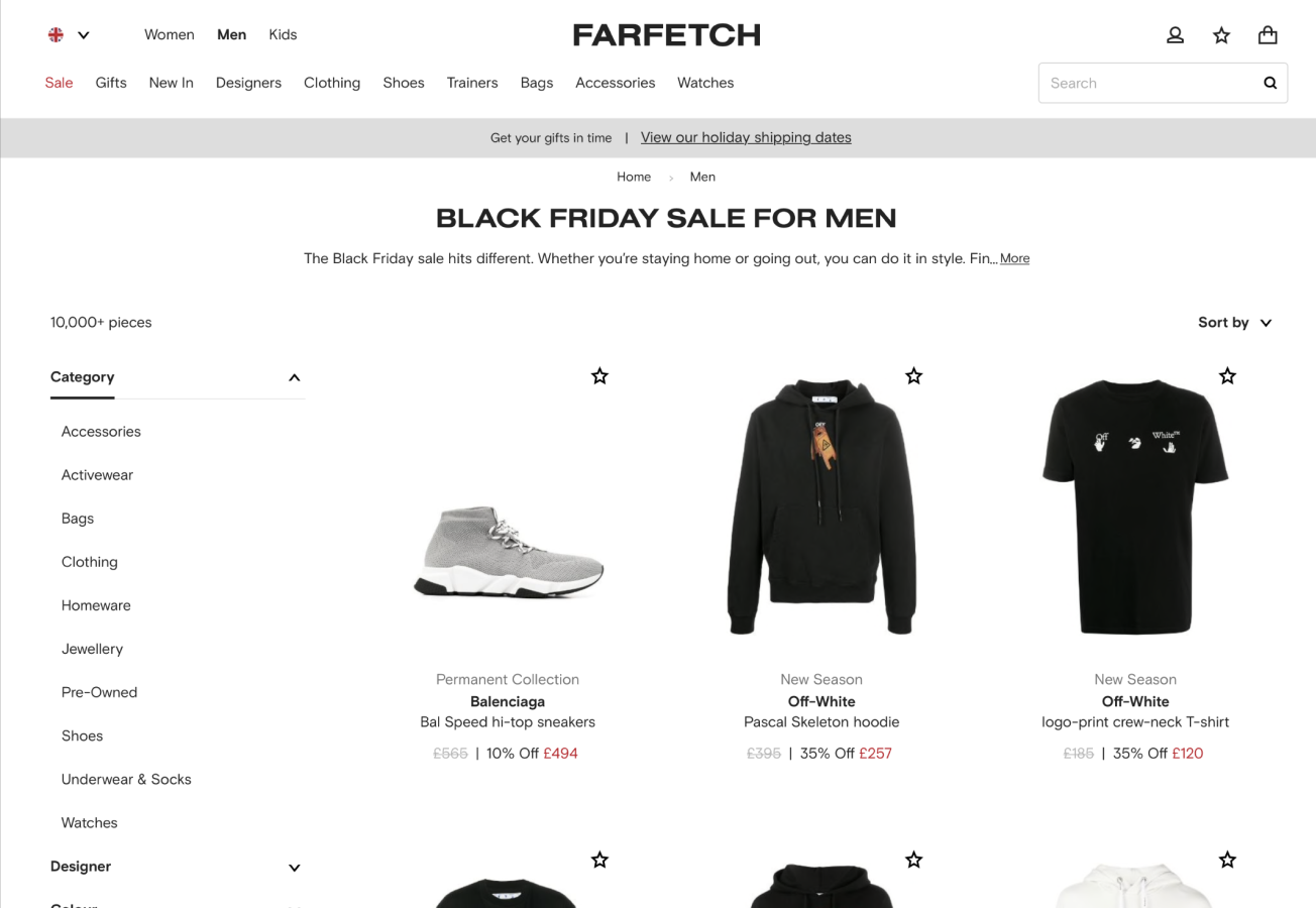
The good & why
Here FarFetch are doing a fabulous job of clearly communicating not only the percentage discount, but also the new price as a result of that discount, so customers know exactly how much they are saving and how much they’re going to be spending.
The bad & why
By contrast End are failing to show any indication of savings, discounts or sale prices on their website. I mean, is it even a sale?!
Black Friday design principle number four
When done well (and this is a key distinction) creating a sense of time pressure and scarcity can encourage users to make purchase decisions quickly.
The good & why
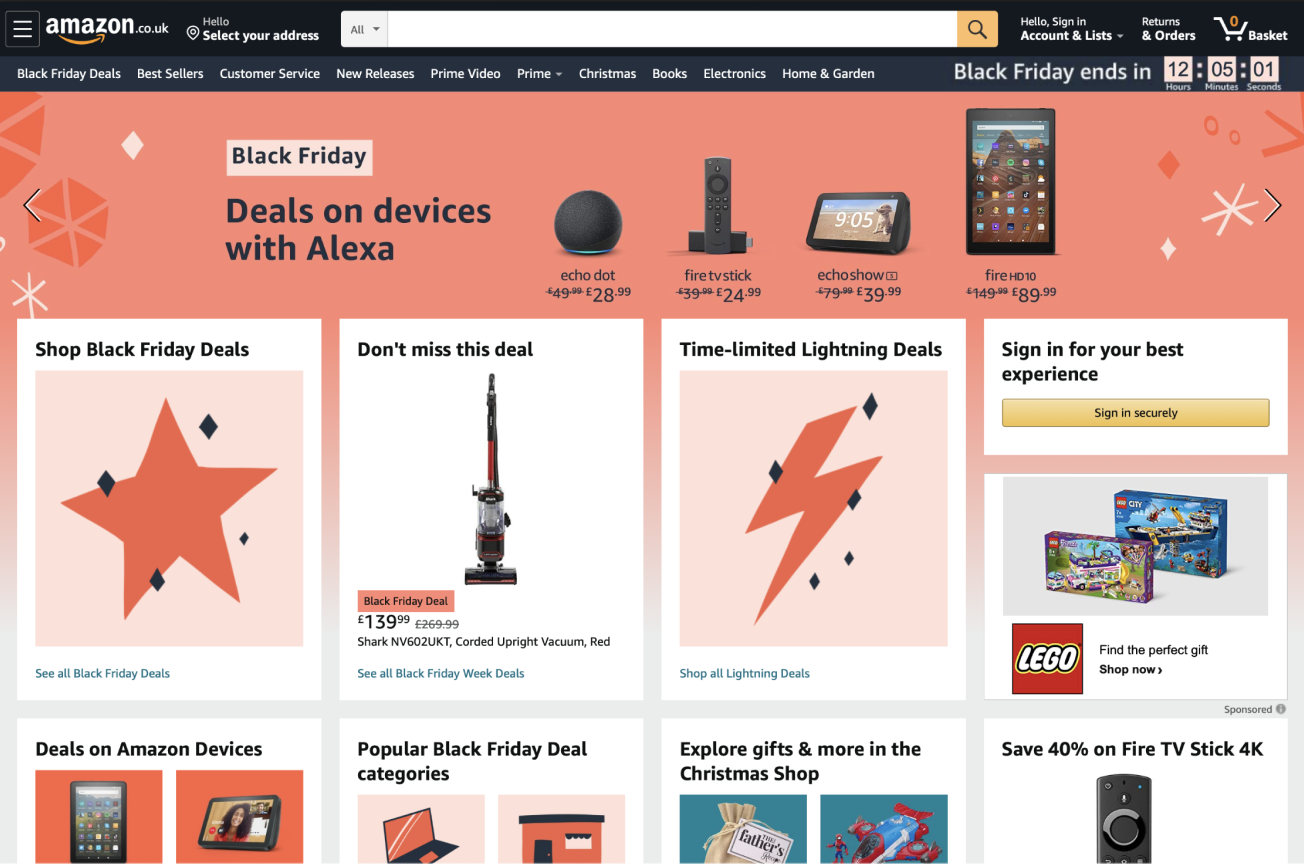
It wouldn’t be a blog about Black Friday without mentioning Amazon and here the ecommerce giant is putting design principle number four to good use. The counter in the top right hand corner of the website clearly indicates when the sale ends and how long users have left to take advantage of their discounts. By placing the countdown in this position it’s clear and in view without being overly intrusive.
Black Friday design principle number five
Make it obvious which products are part of your Black Friday promotion. This is especially useful for users that don’t arrive on your website from a dedicated Black Friday promotion or link click.
The good & why
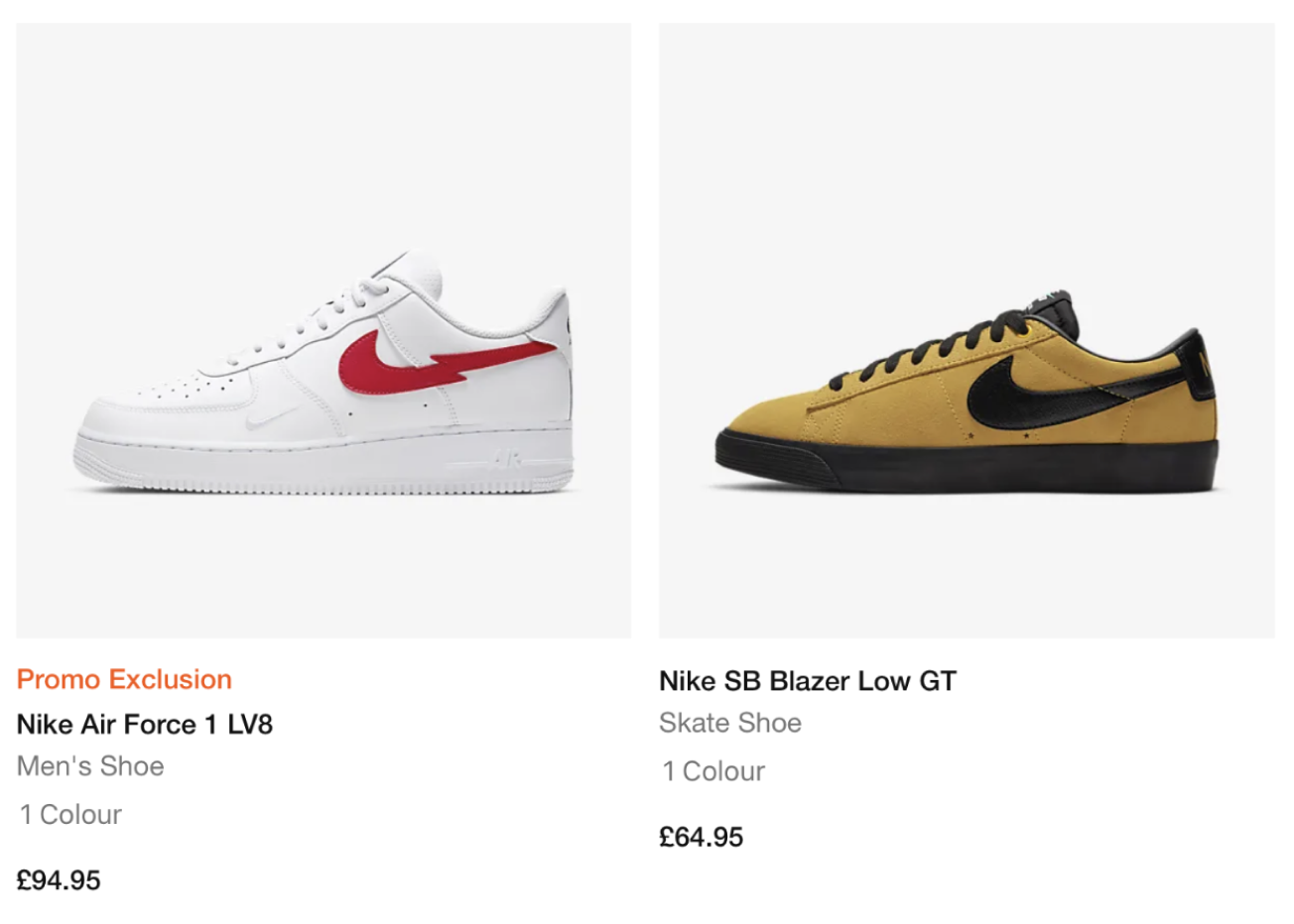
Here Nike are actually applying design principle number five inversely, but the effect is still the same: it’s clear and obvious what is part of their Black Friday promotion and what isn’t and that help’s users focus on the right products for them and avoid that disappointment we’ve all experienced, when we only find out at the checkout, that the item we wanted isn’t valid for an offer!
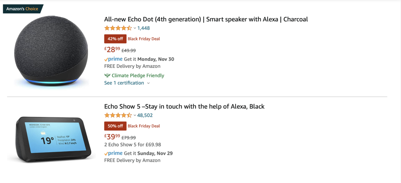
Here’s Amazon applying design principle number five to perfection:
The bad & why
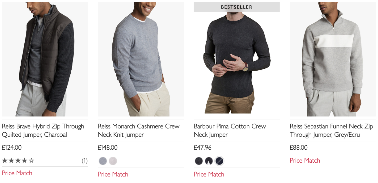
John Lewis are doing a fairly poor job of clearly denoting what’s in their Black Friday sale by offering a price match option on non-discounted items. Not only does this blur the lines of what’s in the sale and what isn’t, it also actively encourages users to leave the John Lewis website and explore prices elsewhere.
Black Friday design principle number six
A well-placed and well considered call to action (CTA) above the fold on your homepage can help users convert faster.
Last year Curry’s did this very well, with a call to action at the top of their homepage offering to help spread the cost your purchase, it appeared before users had even started browsing and may well have helped increase average order values, by encouraging users to increase their spending limits, by taking advantage of the offer.
Black Friday design principle number seven
Take full advantage of your opportunities to up-sell other products. A fantastic way to do this is through product bundling.
Black Friday design principle number eight
In a year that’s been dominated by online shopping, finding ways to re-create some of the in-store joy we’re all sorely missing right now will be vital. Milk Bottle Labs, Ireland’s top experts on Shopify and Shopify Plus affirm this in an article for UX Planet saying “existing bricks and mortar stores who have shifted online should attempt to re-create the in-store experience. Focus on cool unboxing experiences so the customer remembers the entire experience. Don’t ship a box. Ship a reason for the customer to return and even share the purchase”.
Black Friday design principle number nine
Don’t forget to tap into your user generated content, especially reviews, to help increase revenue and demonstrate social proof that can help give others the confidence to purchase. In the midst of the coronavirus pandemic there has been an unfortunate and disappointing increase in consumers’ scams, so now more than ever, it is vital to reassure your consumers and build trust among your audiences.
Now, instead of a tenth design principle we’re delving briefly into what’s frankly, the “iffy” side of Black Friday...
And that’s a practice known as using “dark patterns” or “UX dark patterns”.
Here’s an example: a phone in Curry’s retails for £779 without a discount, but then you find the same phone on Amazon and they’re claiming it costs £779, reduced from £999. A different example of the same thing is when retailers offer Black Friday discount codes but then fail to make the promo code box easy to find and use during the checkout process.
Using UX dark patterns is a fairly long-standing practice and sadly, during Black Friday and other peak shopping days throughout the year, we tend to see more of it than normal. Our advice to brands whatever the time of year would be to stay clear of using these UX design tactics and for the shoppers out there, all we can say it watch out for some of these cheeky little tricks of the trade.
Did you notice any UX dark patterns being used this Black Friday?


