Have you started to notice bigger, bolder headlines, simpler, more universal icons and a general extraction of colours across the websites and apps you’re using?
If so, you my friend have been exposed to what the experts (most notably Michael Horton) are calling “complexion reduction”. This hot new trend first started sweeping through Silicon Valley some time ago now, when the likes of Instagram, Airbnb and Apple all unveiled their monochromatic new looks.
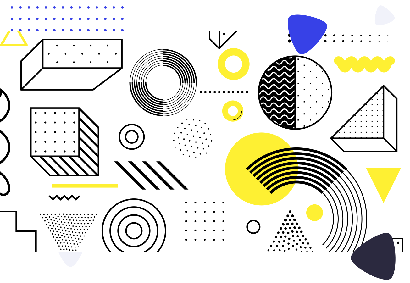
It is a step beyond the flat design movement that has been so popular in recent years and it marks a significant change in the design process itself. Complexion reduction puts the emphasis firmly back on function over form, moving away from colour and imagery to deliver simple, intuitive user interfaces that deliver successful user experiences.
So why is it a pretty divisive trend, a marmite trend if you will, with some loving it and some inevitably hating it? Surely every web designer and even web developers and marketers are all striving towards a better user experience right? Right…but many are questioning if sacrificing our brand identities and heck personalities too is really the best way to do it.
The reasoning behind using complexion reduction techniques in designs, is that it reduces visual noise and this in turn reduces the “perceived complexity” of a website or application. The trouble is, as the popularity of complexion reduction grows, more and more websites and applications are starting to look very (very) similar.

So what are we sacrificing by diluting our brand identities to improve usability through complexion reduction?
Well first and foremost is recognition. These days it can be hard to recognise one app from another and on a practical level, as users hop between apps and websites on a regular basis, it can all start to feel a little bit higgledy-piggledy.
A strong brand is also key for adding value to businesses above and beyond the value of their physical assets. It’s what helps businesses connect with their customers on an emotional level, inspiring brand loyalty, word of mouth recommendations, referrals and even generating buzz, hype and PR. People live and breathe brands day in and day out, talking about them 24/7 across online and offline channels.
All in all, we think the move towards putting functionality first is a good one and it marks some strong progress in the world of design and development.
However, when it comes to complexion reduction, we think it is best suited to applications over websites because we know pretty reliably that when someone opens an app, it’s with a view to getting something done.
Whether that’s booking accommodation, making a purchase or arranging plans with friends, either way, the end goal of the user is to tick something off the proverbial to do list. In these scenarios, functionality absolutely trumps form, and if the app has already been downloaded then it’s safe to say the user has already bought into your brand. Complexion reduction is perfect in this scenario.
However, when it comes to websites, a user’s intention can be less clear. Perhaps they do want to get something done when they visit your website, but maybe they also want to learn a little bit more about who you are, what you do, how you do it… If that’s the case, then having a clear brand is important and so web designers need to consider form and function if they’re to create a website that will serve visitors well whatever their intention or stage on the conversion funnel. So in this scenario, some complexion reduction best practices can work, but going the whole hog might be a step too far.
What do you think?